Underneath is the first attempt of the double page spread that we did. After reviewing this and doing more research into the codes and conventions, plus added feedback from people, we essentially branded this attempt as a piece which would be nearly upgradable. We had bits that were good, and worked well, but the main consensus of the piece was that it wasn't up the standard.
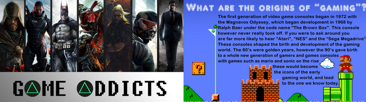
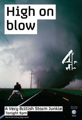
 | One of the only things that was good about his attempt is the title we had on the left side of the DPS. bearing in mind the title normally spans across both pages, but even though this one was, it looks good because of the play of words we have used, mixed with the buttons for letters. |
The triangle buttons for A's is a very good idea we had. we have seen this many times before, whether it be in a gaming magazine, or in something like the radio times. This effect is always used to make it look better, and also relate much more to the topic, rather than just plain text. This automatically makes our DPS look a lot better because we have distorted the text that was originally there. We have already used text that fits in with the theme of the narrative (gaming), so having the title even more related to gaming was a very good ides according to the feedback.
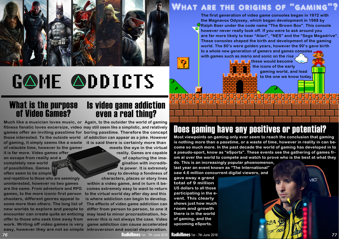
| To the side here, there is the break up of all the different sections of our DPS. as you can see, the page was split up very heavily with 3 seriously different colours. this made it look like it was 3 different articles all put together in 1 montage of articles. this looked seriously unprofessional as the whole dynamic of a DPS is meant to flow well to tempt he reader attention hopefully enticing them to watch your film. We failed to do this and therefore, in our second attempt, we will right this and hopefully make it so that the dynamic of the DPS flows. |  |
Another point that we failed on was the fact that we didn't really use our own images throughout the DPS. Throughout the image, we have not used one single image that we have taken or created. Upon reflection and feedback to this point, it is now clear to see why this would be very bad for creating a DPS. In a DPS, you need to be able to portray what you piece is trying to get across with the images, but also, shows that it is really your film and that you have made it to the best of your ability. So, when we received this feedback, we set about thinking about what images are the best to put in a DPS that signal addiction, or the fact that it messes with your mind.
 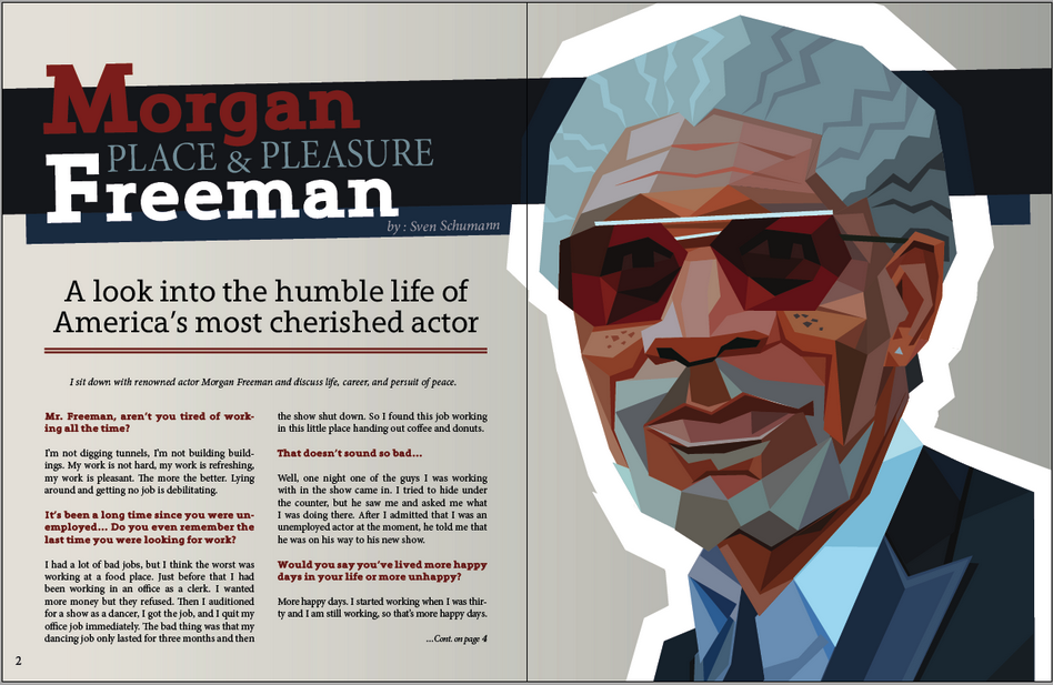 | This is what spans across the top of our DPS at the moment. Almost none of the previous DPS' made for magazines look like that. they all have a title that spans across the width of the two pages. Here is an example of a title that has been done right on a double page spread. The banner behind the title spreads all the way across both pages, making it look more like a good flowing double page spread. its not just the title either, there is a part of Morgan Freeman's self portrait that spans across to the other page. If things seem to flow more around your DPS, then it looks more professional, and it is bound to catch the eye of the reader. |
In all, i think our DPS has a lot of work to be completed, however, it is all very easily achievable. the mistake that we have made when putting together is trying to put to much into it and make it look to fancy. This doesn't come from loads of things on it, it comes from following the codes and conventions of a double page spread. If we make it flow, with our won images, the professional look will come in itself. We will take time to right these codes and conventions and hopefully increase the mark of our Double Page Spread

 RSS Feed
