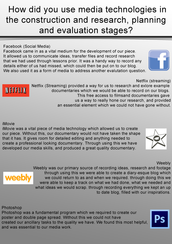
as can be seen above, we made a poster explaining what we used when creating our documentary, it wasn't just when we were editing. we included things from our research and when we were blogging about it on here.
|
as can be seen above, we made a poster explaining what we used when creating our documentary, it wasn't just when we were editing. we included things from our research and when we were blogging about it on here.
0 Comments
Evaluation Questions - "how effective is the combination of your main product and ancillary tasks?"5/8/2016 To address this question we have planned out a blog post of which will highlight the content of our main product and ancillary tasks, and how they work together as a set piece.
As can be seen above, there are our 3 main pieces of coursework. During all three of our pieces we have tried to create a resonating focus which is present in all 3 assets, to do this we worked with codes, conventions and a theme. Our theme was, as the title says, addiction to video games and how it effected individuals. The poster features a topic relevant photo of which we had taken, and edited to make it even more coherent with our subject/broadcaster. We have a dark underlying tone throughout our pieces, which in our poster we made present through a vignette border. To begin with our poster was good however it lacked an edge, which we were able to include through the vignette effect. The double page spread featured a more lighter tone, however it's core text is all about how addiction can take a life, and what effects this will have on the individual and those around them. We again made use of our own image, which we manipulated to make relevant to our subject, and work with our other two pieces. The title is features throughout all three pieces in some way or form, this creates a sense of consistency in our pieces which can easily be seen. Again research was required to make sure that the combination of our film, poster and DPS was effective and intuitive. Through doing this we received positive feedback, which proved to us that we had made an effective combination. The documentary itself is the most complex task we went through creating, and features the highest point of technical skill we could use. We had this made up first, so that when the time came to create the other two pieces we were ready, and understanding of how to link the set together. This is clearly evident through all three pieces, this an be seen through fonts, dialogue and images. These were all aspects we had in mind to create effective pieces, and create a strong link between all three pieces.
For this question we created a Prezi in order to answer efficiently. we felt that his would be a good way to get all our little points across nice and smoothly. It address this question in particular as it creates an interactive session which takes the viewer through our though process and why we included what we did. We do discuss how we think our documentary, and other two tasks , use develop or challenge forms and conventions of real media products.
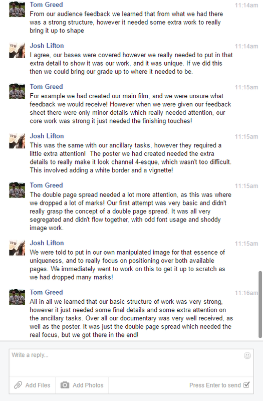 For this evaluation question we used a Facebook conversation as a way to
This is our final entry for our documentary coursework. As can be seen below, our final DPS is very different to the one originally put forward. In all ways it flows better and overall looks a lot more likely to be featured in the radio times. 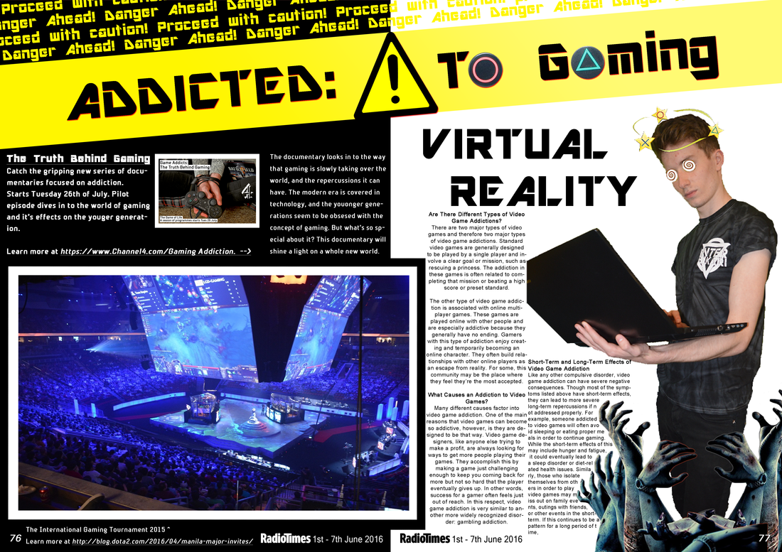 As can bee seen, things flow across the page a lot easier and make it look more professional. with this consistent flow to the DPS, it would more easily catch a readers eye, therefore attracting a lot more attention to the film. There is also the element of using our own images. originally we had none, and now, the own images we had taken fit in much better than the old ones did. We have even added our poster to the DPS to cross our work over, so it catches the readers eyes even more.
After many of the changes that were suggested to us that i mentioned in the first draft post, we altered our posters and the outcome is as can be seen below. 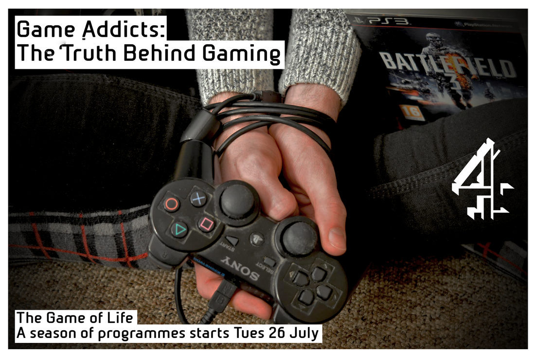 There were not a great deal of changes to be had, but we just added a white boarder around the whole poster and a vignette to make sure the hands were clearly seen by the audience and made sure it portrayed the narrative how we wanted.
When finalising the Documentary, we noticed parts of the interviews could use some more archive footage either to add something to the narrative, or to break up the interview to not make it look so long and elongated. Breaking up the interviews with archive footage will be better to engage the audience.
This video shows how effective a cut show can be in an interview, and we will do this to break up our interviews so that everything flows and makes the audience think and get more engaged in the documentary.
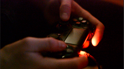
With all the footage finally gained and the voiceovers recorded, we have recently been doing the final process of editing. We had to do a few more reshoots to be able to have all the footage we required to finish the editing. These re shoots were easy to gain because it wasn't anything to do with the actual interviews.
We therefore filmed the shot in the dark os the red light coming form the controller could be seen a lot more clearly, and then add something that would have been subconsciously picked up by the audience. this would have been the dark background. The topic we have chosen has a dark side to it, and this shot illustrates this perfectly. These were the only re shoots we had to do in terms of the actual footage we had to finalise the editing.
This was our first attempt at the channel 4 poster page that we would use to advertise our documentary before it aired on channel 4. After much research, we chose channel 4 for the fact they host documentaries like ours regularly, and ti would be the best channel to address our demographic and reach out to our chosen target audience. The overall feedback we received about this was that it was very good, and looked extremely professional, but th image we had used has not been distorted or tampered with in any way. if we were to improve it, we need to make the image look different, so that could be tampering with the lighting, or making things stand out with a defined outline. 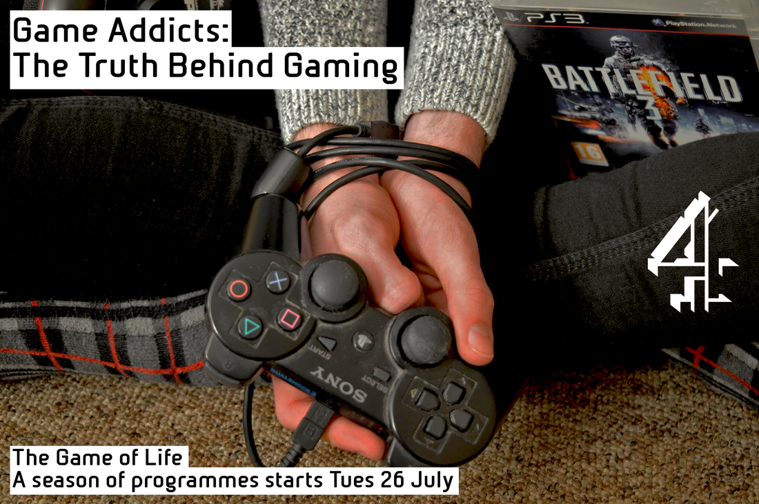
The idea we had to make it the best it could possibly be would be to put a vignette effect on it. If it worked right, then all around the hands and the wrists, which are ties up, the picture would be a lot darker making the main message of the poster stand out compared the the surrounding settings. the surrounding setting are not needed in the clip, but obviously, they are part of the image, so we thought the best way to get rid of them is to just black them out.
With the simple task of distorting the image slightly, it will increase the mark to that which we can get no higher. We have got the text right, the logo in the right place, and the image that fits the narrative, just need to edit the image slightly and then the poster will look good enough to air on channel 4. |
AuthorWrite something about yourself. No need to be fancy, just an overview. ArchivesCategories |


 RSS Feed
